Branding
Ethree
Engineered Efficiency for the Enterprise
Year :
2025
Industry :
Ai Saas
Client :
Ethree
Project Duration :
4 weeks

Overview :
In an era of hyper-scale cloud computing, engineering teams are drowning in "data noise." Ethree was conceived as a high-performance SaaS platform that transforms chaotic backend telemetry into clear, 3D-visualized insights. The goal was to build a brand that felt less like a standard corporate tool and more like an advanced piece of engineering equipment—fast, precise, and authoritative.

Solution :
The solution centered on a "stencil-glitch" visual language.
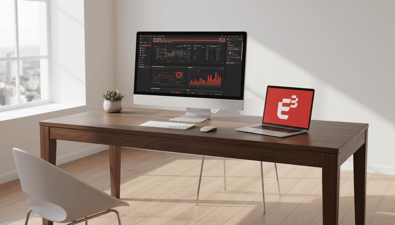
The Logo: The E³ monogram (Efficiency, Engineering, Evolution) uses fragmented geometry to represent data packets in motion.
The UI: I developed a "High-Density" Dark Mode interface. By using a deep charcoal base and a high-energy "Alert Red", the UI directs the engineer’s eye immediately to critical system failures while maintaining a low-strain environment for long-term monitoring.
Glassmorphism: I utilized translucent layers for the dashboard components to maintain a sense of depth and hierarchy without cluttering the workspace.


Strategy :
The brand strategy moved away from the "soft and friendly" tech aesthetic common in B2B SaaS. Instead, we leaned into Technical Brutalism.
1. Trust through Transparency: The landing page features raw 3D network nodes to show users exactly what the AI is analyzing.
2. Mobile-Critical Design: Recognizing that DevOps emergencies happen away from the desk, I designed a mobile experience focused on "Biometric-to-Action"—allowing engineers to authorize server-restarts with a single scan and tap.
3. Hardware Synergy: The branding was designed to exist both on-screen and in the physical world, fitting perfectly onto data center server racks.
Impact :
Visual Recognition: Established a distinct, aggressive visual niche in a crowded market of blue-and-white SaaS competitors.
User Efficiency: Reduced "Time-to-Alert" perception by using high-contrast red accents for critical data points, shortening the cognitive load for engineers.
Investor Readiness: Developed a comprehensive design system that scales from mobile apps to physical infrastructure branding, providing a "built-to-last" impression for stakeholders.
More Projects


Branding
Ethree
Engineered Efficiency for the Enterprise
Year :
2025
Industry :
Ai Saas
Client :
Ethree
Project Duration :
4 weeks
Overview :
In an era of hyper-scale cloud computing, engineering teams are drowning in "data noise." Ethree was conceived as a high-performance SaaS platform that transforms chaotic backend telemetry into clear, 3D-visualized insights. The goal was to build a brand that felt less like a standard corporate tool and more like an advanced piece of engineering equipment—fast, precise, and authoritative.
Solution :
The solution centered on a "stencil-glitch" visual language.
The Logo: The E³ monogram (Efficiency, Engineering, Evolution) uses fragmented geometry to represent data packets in motion.
The UI: I developed a "High-Density" Dark Mode interface. By using a deep charcoal base and a high-energy "Alert Red", the UI directs the engineer’s eye immediately to critical system failures while maintaining a low-strain environment for long-term monitoring.
Glassmorphism: I utilized translucent layers for the dashboard components to maintain a sense of depth and hierarchy without cluttering the workspace.
Strategy :
The brand strategy moved away from the "soft and friendly" tech aesthetic common in B2B SaaS. Instead, we leaned into Technical Brutalism.
1. Trust through Transparency: The landing page features raw 3D network nodes to show users exactly what the AI is analyzing.
2. Mobile-Critical Design: Recognizing that DevOps emergencies happen away from the desk, I designed a mobile experience focused on "Biometric-to-Action"—allowing engineers to authorize server-restarts with a single scan and tap.
3. Hardware Synergy: The branding was designed to exist both on-screen and in the physical world, fitting perfectly onto data center server racks.
Impact :
Visual Recognition: Established a distinct, aggressive visual niche in a crowded market of blue-and-white SaaS competitors.
User Efficiency: Reduced "Time-to-Alert" perception by using high-contrast red accents for critical data points, shortening the cognitive load for engineers.
Investor Readiness: Developed a comprehensive design system that scales from mobile apps to physical infrastructure branding, providing a "built-to-last" impression for stakeholders.
More Projects
Branding
Ethree
Engineered Efficiency for the Enterprise
Year :
2025
Industry :
Ai Saas
Client :
Ethree
Project Duration :
4 weeks
Overview :
In an era of hyper-scale cloud computing, engineering teams are drowning in "data noise." Ethree was conceived as a high-performance SaaS platform that transforms chaotic backend telemetry into clear, 3D-visualized insights. The goal was to build a brand that felt less like a standard corporate tool and more like an advanced piece of engineering equipment—fast, precise, and authoritative.
Solution :
The solution centered on a "stencil-glitch" visual language.
The Logo: The E³ monogram (Efficiency, Engineering, Evolution) uses fragmented geometry to represent data packets in motion.
The UI: I developed a "High-Density" Dark Mode interface. By using a deep charcoal base and a high-energy "Alert Red", the UI directs the engineer’s eye immediately to critical system failures while maintaining a low-strain environment for long-term monitoring.
Glassmorphism: I utilized translucent layers for the dashboard components to maintain a sense of depth and hierarchy without cluttering the workspace.
Strategy :
The brand strategy moved away from the "soft and friendly" tech aesthetic common in B2B SaaS. Instead, we leaned into Technical Brutalism.
1. Trust through Transparency: The landing page features raw 3D network nodes to show users exactly what the AI is analyzing.
2. Mobile-Critical Design: Recognizing that DevOps emergencies happen away from the desk, I designed a mobile experience focused on "Biometric-to-Action"—allowing engineers to authorize server-restarts with a single scan and tap.
3. Hardware Synergy: The branding was designed to exist both on-screen and in the physical world, fitting perfectly onto data center server racks.
Impact :
Visual Recognition: Established a distinct, aggressive visual niche in a crowded market of blue-and-white SaaS competitors.
User Efficiency: Reduced "Time-to-Alert" perception by using high-contrast red accents for critical data points, shortening the cognitive load for engineers.
Investor Readiness: Developed a comprehensive design system that scales from mobile apps to physical infrastructure branding, providing a "built-to-last" impression for stakeholders.